How do you decide where the design of your printed fabric is placed on the garment you are making? It pays to spend time planning exactly where the dots, lines and stripes are going to lie when cutting out, to avoid any unwanted surprises when sewing up. Many prints are straightforward, but others like this one I am working with are a bit trickier. Here I’ll run through my thought process while preparing to cut this fabric, and share a few tips along the way.
I purchased this peacock feather print several years ago from The Fabric Store in Auckland. It is a Tory Burch cotton/silk and it is a beautiful print, a bit loud for my usual taste but sometimes you have to make exceptions. I plan to turn it into an even louder dress!

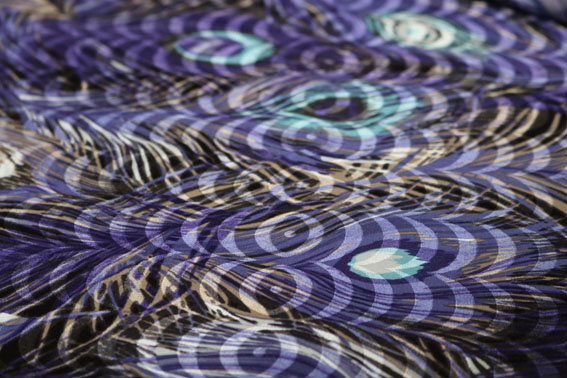
When I first looked at this fabric the dark purple feathers with the light centre looked the most dominant, and decided to plan my dress around those. Thinking I might write a blog post on pattern placement, I took a photo. In the photo all I could see were three glaringly obvious white feathery lines!! These did not stand out to my eye at first, so lesson #1 is: take a photo!
Above, you can see the full width of the fabric laid out – notice that the lines of light feathers are not centred on the fabric. An offset pattern like this means I will need to cut as a single layer, or cut on the fold with the fold placed off centre, if I want to balance the print.

Here’s a closer look (horizontal now), isn’t it pretty? The light feather lines are still obvious. Although all the feathers run fairly equally in both left/right directions, the dominant light feathers run in one direction only. I plan to cut the fabric so the light feathers run upwards on my dress, so effectively this is a one-way fabric and will be cut to a ‘with nap’ layout.

Let’s zoom in a little closer to see what other surprises this fabric has in store. See those dark/light scallops? This fabric has a damask weave which creates a satin/matt texture variation. This is obvious in some lights but not in others so it’s really easy to miss! Not only that but the scallop pattern changes direction every 20cm or so – you can just see one mirroring of the design in the left of the photo above, and the other reflection more obviously in the photo below.
So, another thing I need to think about when cutting this fabric is lining up those scallops across the fabric in the finished dress. May I also mention that the pattern repeat of the feather print is in a completely different sequence? Phew – this fabric is going to require some concentration when cutting!
Now that I’ve determined that the light feather line is dominant, how do I decide the correct positioning of this line on my dress? Take more photos of course!
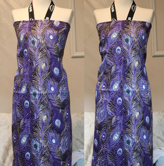
Do I position the light feathers at the centre front of the dress, or to the side? I prefer them offset to the side as it seems less obvious.
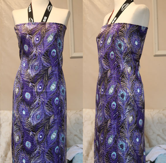
Or do I position it evenly on both sides? I’ve rotated the mannequin to show more clearly what I mean. Although this looks more balanced from the front, I ruled out this option. It would result in two light feather stripes close together near the side seams which would look odd.
At this stage I step back and ask myself if I am overthinking things, as I’m often known to do! After clearing my mind with a good night’s sleep, I’ve decided to go with option two where the dominant white feathers are offset to the side.
But I still haven’t cut the dress out…
This means you still have time to say what you think! Would you do it differently? I’d love to hear your ‘rules’ and opinions on pattern placement too. Maybe I’ve missed something glaringly obvious!
Oh – and I haven’t even thought about the sleeves!…

THANK YOU for a great how-to post. So many times AFTER making something I have noticed a hidden pattern within a print. So frustrating. I will definitely be pinning this post to refer to again and again and again.
LikeLike
Fabric observations are personal, I guess! Looking at the picture where you see three white feathery lines my eyes are drawn to the three dark purple lines. It means I prefer option two, but for different reasons 🙂
LikeLike
Taking a photo is a great idea; I have a garment that has an oddly off-center stripish area that totally wasn’t noticeable on the flat yardage but suddenly popped once it was constructed.
My first thought when I saw the fabric…before you mentioned the stripe effect…was the potential bulls-eye effect of the circles. But that’s because I once paid no attention to circles on a print and they ended up in the worst position possible.
That’s a gorgeous print and it’s going to make a stunning dress.
LikeLike
I, too, prefer option two for this incredibly beautiful fabric.
LikeLike
I think I prefer option one, although I don’t think option two looks “wrong” either. Taking a picture does help to show what your eye might miss.
LikeLike
I prefer the off-set position of the light feathers too. It is a more subtle placement, and in real life, the overall pattern effect will be preserved. With the center placement, I think it would tend to focus too much on the lighter feathers as a design element. Just my opinion! Admittedly, I’m not a big fan of mirror-image matching either.
LikeLike
I prefer option#3. My eyes see the whole dress with this option and do not focus on the line down the middle. The fabric is beautiful and which ever option you choose the dress will be stunning. I am looking forward to seeing the dress finished.
LikeLike
I prefer option 2 as it avoids unfortunate bulls eye placement of the feathers. It also avoids focusing on the geometric aspects of the fabric in favor of the lovely feathers.
LikeLike
Like Lorna, I’m preferring option 3. With this placement I’m seeing the dress and not a line somewhere down the front. Whichever you chose, it is going to be a great dress!
LikeLike
Option 2! Really interesting to hear your process, I’m prone to winging it and hoping for the best (I guess I like surprises?!) and luckily it’s worked out so far. I can see why you’d need to be careful with this print though. It’s beautiful.
LikeLike
Apart from taking photos, I just learned (the hard way) another important trick: measure the pattern! I recently cut out a bias plaid skirt, putting far too much time and effort into matching all those bias plaid lines…. and at the very end realized that the plaid “squares” were actually rectangles.
Lesson learned: Measuring the print before cutting would saved a lot of time (and saved a nice piece of fabric for some other project!)
LikeLike
Beautiful fabric! Option 2 it is for me.
LikeLike
I’m voting for 3. Having said that the photo is a great idea because I have bought a dress with a huge set of tongs on it (really? I didn’t see them) and a dress with a flower spray in the position where a flower spray did not look appropriate
.
LikeLike
That’s going to be a beautiful dress, however it’s cut (which I’m sure you’ll have already done by now). Can’t wait to see how it turns out.
LikeLike
Interesting how the fabric has so many layers and taking a photo shows them up so much better. I can spend too much time with patterns but so far the dreaded bullseye has been avoided. I do like #2 with the offset line and will be very interested to see what you do for the sleeves.
LikeLike